


Phase 2 of the Redesign: Wireframes
The Airfleet Website Redesign Series
Welcome to the next phase of our Airfleet.co redesign: Wireframes!
Wireframing is the first phase of the design process. Its focus is usability and function. It requires an understanding of the client’s goals, what the client wants to communicate, and how that would best work as a user interface without incorporating specific content or brand visual identity.
Although wireframing sounds like something technical, it is in fact the art of guiding users through a sales journey (although we all know end users often deviate from these plans and must plan accordingly). We have to calculate many factors into the buyer journey like overall messaging goals, what the buyers pain points are, where the user is in the journey and which information they’ll need.
Knowing all of this plus the client’s marketing goals is necessary and informs the sizing of elements, button positions, what to show first, and several other design factors.
During phase one of our redesign process, our CRO experts create a manifest of the page types needed, an information hierarchy, our taxonomy, and our navigational schema.
The creative team collaborates with and works in parallel with our conversion rate optimization (CRO) experts throughout the wireframing process to incorporate elements from the information architecture build-out into the wireframes.
We followed the same process during Airfleet’s redesign as we would follow with our clients. Here’s a peek at how it all works.

Wireframe requirements gathering
I believe that content must dictate the design. In order to create a compelling design, we must know all about our clients and their audience’s needs at each step of the buyer journey.
Here are some things we must know about a client to make a website that sells:
- What are your key differentiators?
- How does that differ from your competitors?
- How do you typically win in a head-to-head deal with competitor X, Y, or Z?
- What pains causes someone to research a solution like yours?
- Who is on your typical buyer committee? Which roles do they play?
With that groundwork in place, we establish a quick map or representations of the information by parsing them into sections. This is where we begin to reconstruct content in a way that fits web usability.

For Airfleet, much of the usual requirements gathering was unnecessary. However, it was mission critical that Elad and I agreed on how we wanted to represent Airfleet to potential customers. We wanted to put our professionalism on display by showing our expertise through a beautiful, functional design and by plainly stating what we do and what we know.
We never advocate for using fluffy terminology and empty promises. Our goal with Airfleet.co was to prove our expertise by communicating our processes with absolute transparency.
How does information architecture come into play?
Typically, the Airfleet creative team works on wireframe design while Alistair Fairweather (our CRO expert) refines the more technical aspects of the information architecture work, such as URL schema and link building. When we suggest page layout options, we have a page manifest and a solid understanding of the website taxonomy.
Between the page manifest, website taxonomy, and the creative team’s information gathering (brand guidelines, marketing and messaging goals, and a thorough understanding of the client’s pitch deck), we can propose different design options for the core pages. For example, we know that on a solution page, we’ll want some variation of the following (with room for creative solutioning for that client):
- Navigation
- Hero
- Testimonials
- Product descriptions (often multiple)
- Case studies
- CTAs and navigation to related pages
- Main CTA
- Footer
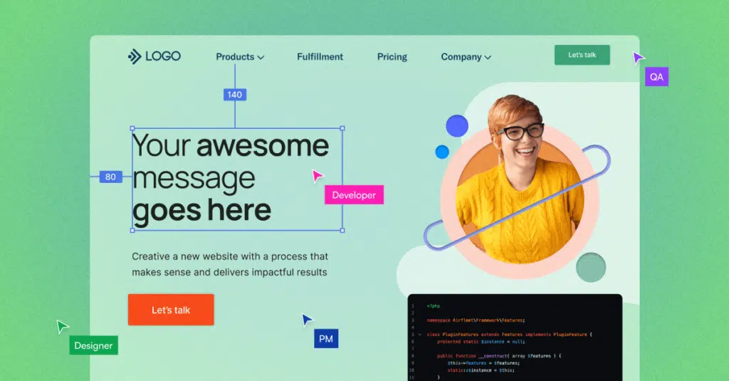
This is when we select the appropriate elements from our wireframe tool:

And then form a proposed set of options in the form of a full-page layout for our client:

Throughout the wireframing process, we present multiple options and talk in detail about how those options meet their goals differently. We guide them toward the solution that offers the best experience. We do this through demonstrating the visual and interactive approach in terms of overall messaging, order of sections, and the different variations in section design we could take with the same content.
Something to Know: We have existing UX guidelines
We use a design system that has become a natural part of the process for every client. The system is in place because this is the way to create consistency in all design elements, have complete control and view on the styling and allow website scalability. The tool is a starting point to discuss the ideal user experience and we innovate through design to ensure the user’s needs are being met in an intuitive manner.
There are some guidelines that we stick to more closely than others. These elements, like padding and margin pixels or device screen dimensions, help us go through development and site management without impacting the final user experience. It’s all about balancing creativity with usability.
We have a Notion page that details Airfleet’s design system, with the callouts we generally try to follow in Figma, such as sizing for canvas frame, outer frame, background image, inner frame, grid frame and layer labeling, images, text, and color standards. Here’s an example:

When is wireframing “done”?
Many iterations of wireframing take place before the website is built. We continue to adjust and guide our clients toward the best design to support a seamless buyer journey.
In Airfleet’s case, we wanted to design a website that embodies many of the latest trends in B2B website design. For example, we see many companies thinking more about the user experience and creating interactive websites. We see fewer diagrams and explainer videos and more straightforward descriptions of what people get and how it benefits them.
As always, we aim to balance vision with attention to functionality and usability.
For example, Elad wants a no-nonsense communication style regarding product offerings and our expertise. He wanted to focus on what we do and how good we are at doing it, so leaning into text and bullet points was tempting. However, end users have subconscious standard and visual preferences. So what started as this:

Eventually ended up as this:

The wireframe process allowed Elad to communicate the approach he wanted to take and gave me the latitude to propose usability and visual design improvements.
Wireframing isn’t done until the website is live, and even then, it’s important to remember that a website should constantly evolve with the expectations of potential buyers, our products, and our go-to-market strategy. In other words, a website is never done, and jumping into Figma for another touch-up is always on the table.
That wraps up our wireframing phase! Stay tuned to learn more about how we landed on messaging and a big change in our visual identity.


