A Crash Course on Color Theory for Website Design

Why are color palettes important to website design?
Colors have been used to communicate and evoke emotions. Our visceral response to color is coded in our DNA – humans are hard-wired to interpret colors subconsciously. Colors signal action, produce emotions, and can influence psychological responses about your brand.
If you didn’t care about your B2B business’s brand colors, consider this your sign to get invested. Your color palette says a lot about your brand – even when people don’t consciously realize the reason why they make snap judgments is because of their color-flooded lizard brain.
We think of colors choices in website design as serving two main purposes:
- Create the appropriate response and level of engagement
- Direct a website visitor to their next step in the buyer journey
Let’s break down the science and art behind color choices, and then I’ll share some traps I see people fall into during the design phase.
Where do colors play important roles?
Colors play different roles across different elements on a website. Let’s look at key elements and call out a few trends or things to look for. These elements are listed in my order of importance.
Imagery and animations
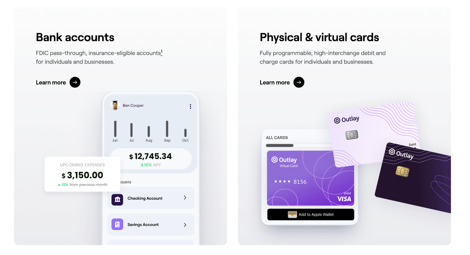
Images and animations can support messaging and content or it can create a big distraction. A trend we see is concentrating color distribution on illustrations, other images, and animation. This creates a high degree of contrast from the background and text. When done well, it can create a focal point without detracting from the text, which must remain clean and highly readable.
Section backgrounds
Backgrounds are meant to be a backdrop, which is why we use stringent guidelines when creating them. Colors should be used carefully to not overwhelm and saturate the on-page experience.
Icons
Icons aren’t just cute illustrations. They should have a purpose. Color can help direct visitors’ focus so they take in the content.
CTAs
We want the color to be inviting while being bold enough to stand out. We also must consider legibility of the text (if applicable) and whether users can correctly interpret where the CTA leads.
Fonts
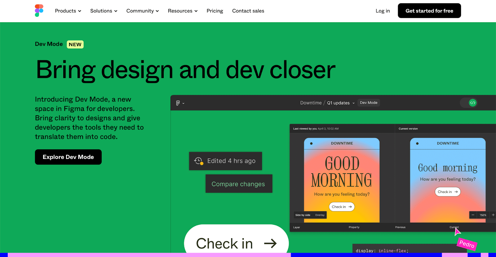
The degree of contrast in color between the font and the background is critical to whether or not a page is considered accessible. We also use colored text or highlights to make a message stand out.
The many ways color matters in website design
I’ve listed how colors can impact elements on a website, but let’s explore color theory across important aspects of design.
Accessibility
Did you know Google measures the contrast between background colors and text colors? A lack of contrast and legibility (an extreme example of poor font choice would be the dreaded Wing Dings) will lower your overall SEO score. This applies not only for headers and paragraph text. Buttons, small tags, sections with CTAs, and more are in Google’s line of sight.
Sometimes we need to compromise and select new palette options to ensure Google and our end users are able to read all the content properly.
For example, orange is rarely used on the web for this reason (unless you’re HubSpot!).

Visual Contrast
Beyond Google accessibility compliance, contrast is very important because of its ability to catch and hold a visitor’s attention.
However, contrast doesn’t necessarily mean we should select a vibrant color – like poison green. Bright colors aren’t efficient if the background or images steal attention from the viewer. If they don’t see the button, they won’t use it.
If designed well, dark buttons can be an excellent choice.

We must keep usability in mind when making color choices, particularly when it comes to CTAs. I would rather focus on contrast than prioritize the vibe (while adhering to the brand palette, of course).
Creating balance
Imbalance can cause end users to lose focus and get distracted, which means they’ll leave your website. When using a lot of colors in imagery and backgrounds, you must keep your fonts and buttons minimalist (black or white).

Busy visuals should come with clean and basic text and backgrounds, while text focus sections may use background colors and CTAs. Either the callout and content or the background should be colorful, but they should never both be colorful.
Make good vibes
Remember the bit about color psychology being a thing since the beginning of humans? Colors are there to create an experience and they have an immense role in giving out a vibe.

Remember, it’s not just about which colors to choose. It’s how to use them in the right amount to set the vibe.
Do NOT color code
Sometimes the urge to create an organized rule book outweighs functional web design. Your brand is not the same as a software platform. We want consistency across the brand in our palette, but don’t color code products, categories, or elements. Otherwise, you’ll find yourself stuck with a purple product page without being able to use purple anywhere in the homepage.
Use unique colors when you need to and don’t get stuck in a pattern that doesn’t serve the website well. For example, use different colors for the same product on different pages if you need to.
Don’t set unnecessary rules that limit the possibilities for color to give life and contrast to your pages.
Trap #1: “I want a clean website!”
Many clients I’ve worked with want a “clean page” but can’t put the finger on the right level of clean.
That’s because “clean” can quickly become unreadable as it will lack contrast. Asana is a great example of “good clean.” The images are interesting, which balances the lack of color elsewhere:

In the following Asana example, they use very good levels of contrast to set apart the image while not detracting from the text. Their button is very simple, but easy to spot:

Again, balance, contrast, and the vibe you want to set should be the driver behind color palette choices.
Trap #2: “I want a vibrant website!”
People equate vibrant with all the colors on the color wheel. Contrary to popular belief, we don’t need a broad palate to make things vibrant.

We recommend a palette to include one or two main colors and three to four supporting colors. The rest of the colors that your brand uses will be expressed in the visuals (illustrations, photographs, animations, etc.). This will create a tidy and consistent looking website without sacrificing your brand palette.
In my opinion, colors are here to help us to separate sections, build a rhythm for greater scroll depth, and help companies to amplify their message and assist users to find what they are looking for. Color selection for your brand and website design are not tasks any company should take lightly.
